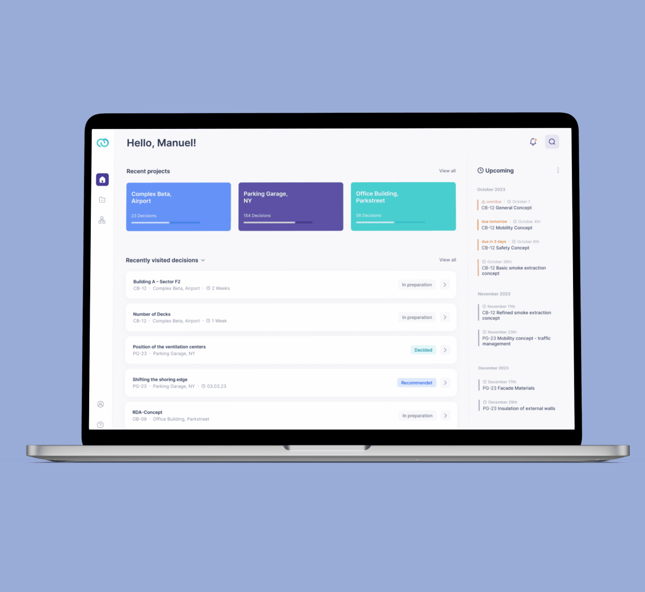
Anchor Decisions App
Client: Anchor Decisions
Role: UX/UI Designer, Product Designer
Sector: Software, Architecture & Construction
Scope: 8 Months, Apr – Dec 2022

Resoo App –
A collaborative approach
to Decision Management
Overview
Construction projects often require hundreds of complex decisions to be made, coordinated and documented and are often handled in various offline forms, tables and different planning apps.
Resoo ensures that all neccessary parties are involved and have a complete overview of past and future decisions in one place, as well as the impact they create on the overall project.
Solution
After re-structuring and re-designing the app, 100% of testers found it helpfull for their projects and where excited to try it in a real project
Task
Pinpoint the product vision and how we can help our custumers to improve their decision management
Restructure the app to improve usability and user experience, so experienced and unexperienced users can take advantage of the advanced algorhythms aiding decision processes
Craft a compelling Interface Design
Integrate and visualize new features
User Research

Some pain points
Collecting qualitative data
Before embarking on the redesign and the Integration of new Features, it was crucial to gather concrete evidence of our users pain points. To accomplish this, we carefully planned our research sessions, outlining what information we hoped to uncover.
Refining our hypothesis
how are our users doing decision management up to now. How do processes work?
how can we build an intuitive and transparent flow?
which main-use cases do we have?

Needs & Wishes
Uncovering Key User Concerns with User Interviews
Our initial usability test and Interview was conducted with 11 persons. These Users had different familiarity with decision management processes and were from different departments and regions.
Our primary objectives were: first, to gain a deep understanding of what our users required from a decision management software, and second, to evaluate their experiences with our prototype.
Throughout the course of these tests and interviews, a series of significant usability issues came to light:
80% of users encountered difficulties locating essential functions or faced challenges in completing the decision-making process. They expressed a strong desire for improved guidance and access to information throughout the workflow.
91% wished for a different display of the results

Organization of all findings in an affinity diagram
ANALYSE AND DECIDING OUR NEXT STEPS
To sort through the subsstantial amount of data and decide what the most pressing needs were, we collected and then orginized all findings with the help of an affinity diagramm. This made it easyer to fifferenciate between bugs, possible future features and problems of different priority, that needed to be adressed.
Information Architecture & Prototypes
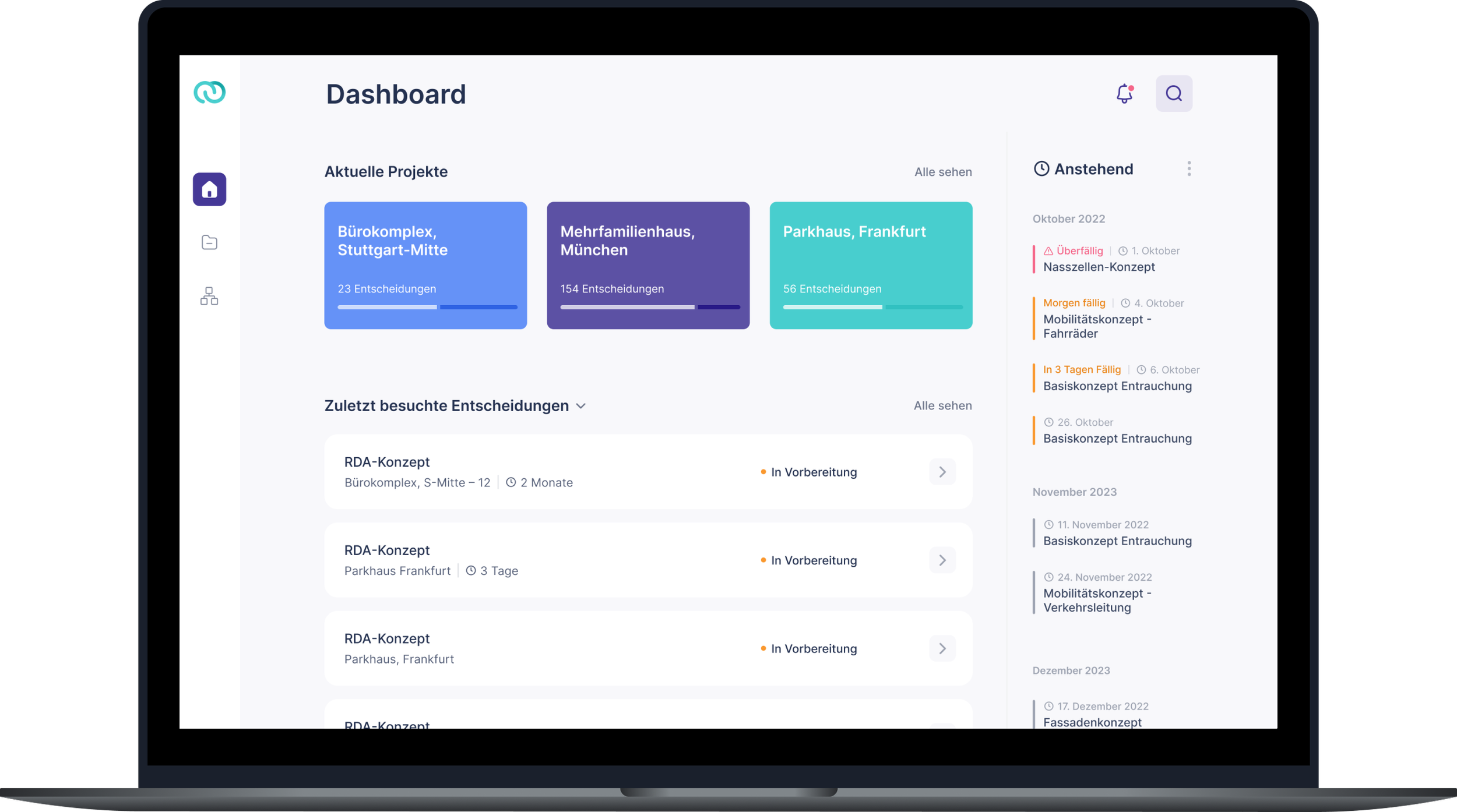
Restructure the Dashboard site, and emphatise the different use cases and options
Craft a more guided decision management flow, to allow experienced and unexperienced users to make use the apps powerfull algothythms
Present the Results in a more comrehensive way
Armed with this valuable feedback, our next logical step was to strategize how to create a more refined user experience that addressed these concerns and issues. It became evident, that we should focus on improving our Information architecture and content structure first, as these where the areas most people got stuck in the process. So our primary focal points where these core issues:
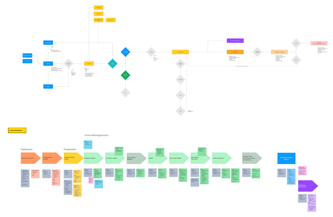
USER JOURNEY MAPS
Various iterations of user journey maps were created, to facilitating team discussions and defining the most holistic and comprehensive way to walk through the decision-making process.
USER INTERFACE DESIGN
Our focus was to further improve user experience by establishing a clear visual hierarchy, that seamlessly guided users through the process. The new designs were tested and iterated several times, until we felt confident in our product vision.
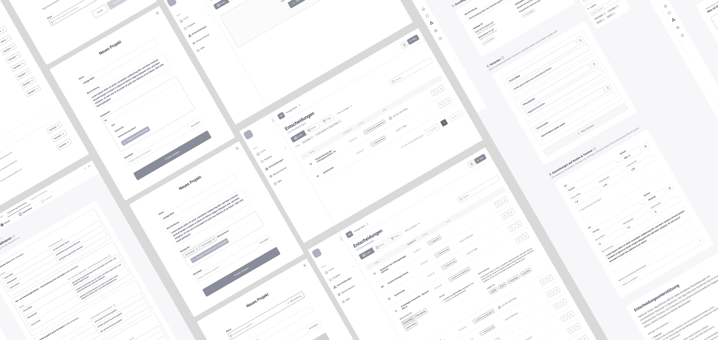
LOW TO HIGH FIDELITY PROTOTYPES
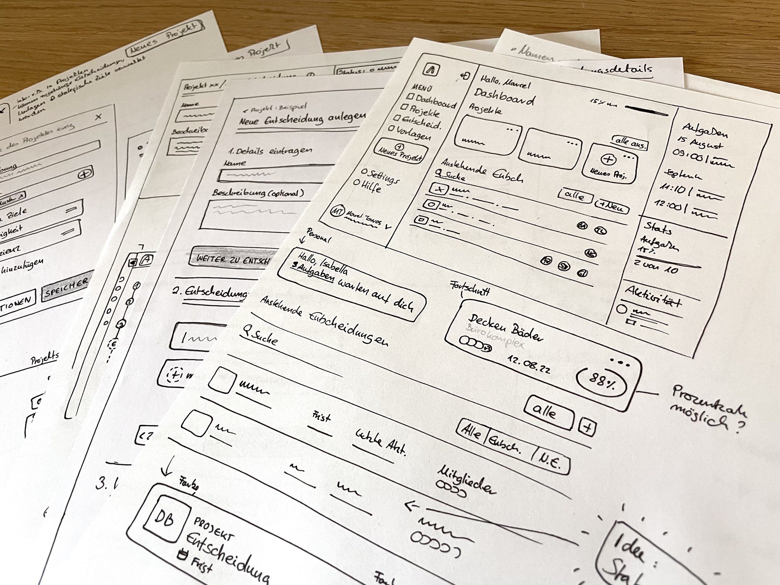
Our next step was to re-design the existing app, and try to find solutions for all problems we came across, in the usability tests. Different design ideas where discussed, evaluated and improved step by step. Starting with paper sketches and moving from low to high fidelity wireframes and prototypes.

Quick Sketches of Interface Modules
Visual Design Strategy
Simultaneously with the UX/UI design process, a new logo and name were being developed. Thats why up to this point, all designs were crafted without colors. The freshly redesignd logo was our starting point for the visual design, all colors and type where chosen to build an appealing product that is flexible and scalable. As resoo is a completly new brand, another key aspect of our design endeavor was crafting a distinct aesthetic and continous user-journey, that appeals to potential customers and makes them exited to try out the app.
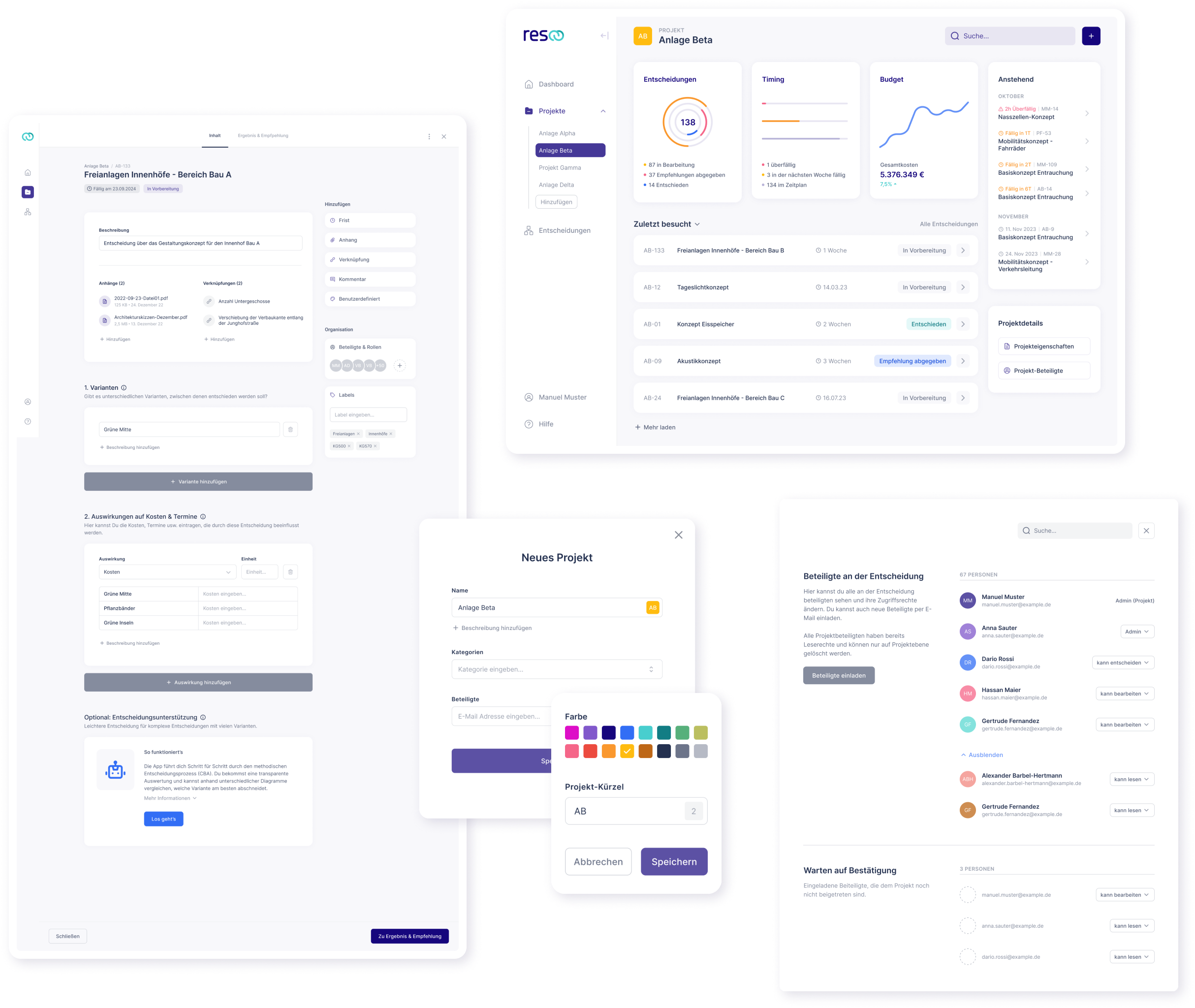
To streamline the development process for new prototypes, we meticulously organized all components into a comprehensive library, minimizing the time required for new prototypes and development.
After continuously testing the critical elements of the app, the development team started implementing the structural changes and design library into the initial MVP version of the product. Regrettably, this marked the point where I had to conclude my involvement in the project.
However, I ensured the preparation of a well organized and documented library and files. Drawing confidence from the positive feedback gained from our usability testers, I am optimistic that our product is poised to not only meet but surpass the expectations of its users.

Design System and Handoff
Handoff & Conclusion
After continuously testing the critical elements of the app, the development team started implementing the structural changes and design library into the initial MVP version of the product. Regrettably, this marked the point where I had to conclude my involvement in the project.
However, I ensured the preparation of a well organized and documented library and files. Drawing confidence from the positive feedback gained from our usability testers, I am optimistic that our product is poised to not only meet but surpass the expectations of its users.
Design System
To streamline the development process a design system was created, enhancing collaboration among team members by providing a shared visual framework. By organizing all components into a comprehensive library, design consistency was ensured through all pages.
Additionally, the system simplifies maintenance, making updates and iterations swift and seamless.

Screenshot of the design systems basic components
